 Free shipping on orders $50+

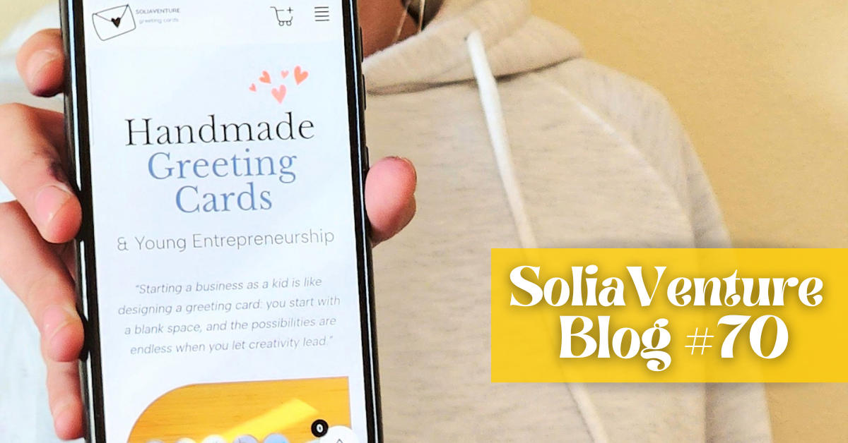
What we’re doing wrong with our website
Have you ever landed on a website and thought:
Wait… what exactly are these people about?
There’s plenty to look at, maybe even too much. But somehow, instead of making you want to keep looking, it makes you want to leave.
Well… we recently realized that might be our website. 😬
When we started making cards, we had A LOT of them. Most were handmade, and we put pretty much all our favorites on the website. If someone ordered one, we were ready to make it again.
At the time, we liked each of them on their own.
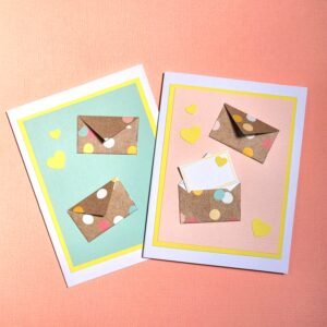
Watercolor. Colored pencil. Black-and-white drawings. Origami. Very different illustration styles.
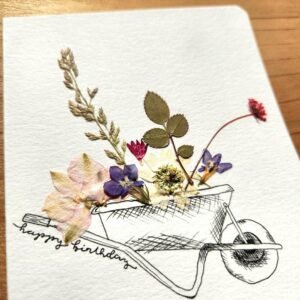
There just wasn’t much tying everything together. So we made one obvious first move: we removed all the cards that were handmade.
Goodbye to this one:
And our origami baby collection:
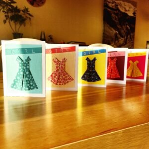
The selection immediately became smaller, but also clearer.
There’s still plenty of variety in the printed cards that remain, though, so we’re not pretending the problem is solved.
And then there are the photos.
That might be an even bigger mess.
When we built the website about a year and a half ago, we didn’t know much about product photography. We were also using some of the same photos we had taken for Instagram, without really thinking about whether they worked together as product photos on a website.
Some cards were photographed inside.
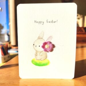
Some outside.
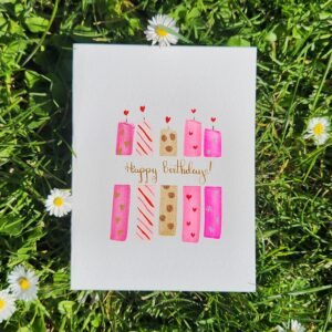
Most with completely different backgrounds.
Not to mention the lighting that changed from one photo to the next.
Basically, consistency was not part of the plan.
We hadn’t really stepped back and looked at the whole collection as a brand.
And that’s what we’re starting to do now.
The photos are one of the first things we can fix. We’ve started testing a very simple background in Canva that we could use across the card photos.
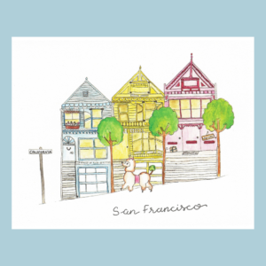
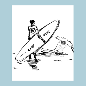
We’re also planning to work with a professional who can teach us how to photograph the cards properly instead of us continuing to guess.
At the same time, we’re reading How to Style Your Brand by Fiona Humberstone.
We like that the book doesn’t begin with “pick your colors” or “make a logo.” It starts with much more basic questions about identity.
One we especially liked was:
How should your ideal clients feel when they look at your newly styled brand?
That made us wonder how people might feel when they land on our website now.
But then came another:
Is there a type of client you’re not currently attracting?
YES.
Store buyers.
When we walk into a store and the buyer is there, we often sell our cards. We only bring our printed collection, and we tell the story behind the business.
But when the buyer isn’t there and we have to follow up by email, we rarely hear back.
When we’re not there, the website is doing the talking for us. And right now, we’re not sure it’s saying what we want it to say.
So we need to figure out what the SoliaVenture brand is in the first place.
What should it feel like? What belongs? What doesn’t? What’s part of our identity?
Actually… what is our identity? 🤔
Go take a peek at the website now, while it’s still very much the before.
Because when we come back and show you what changed, you’ll know exactly what we were talking about.
See the before
Before you go
💌 New here? You can still catch up — read our previous newsletters here.
Solène & Zélia, for SoliaVenture