 Free shipping on orders $50+


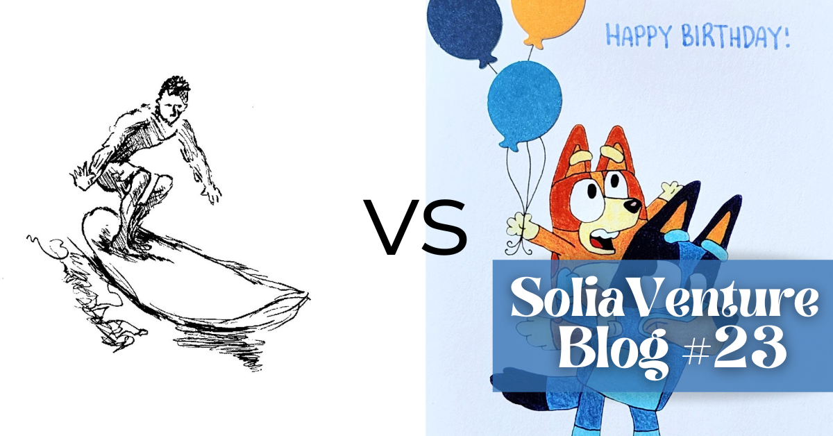
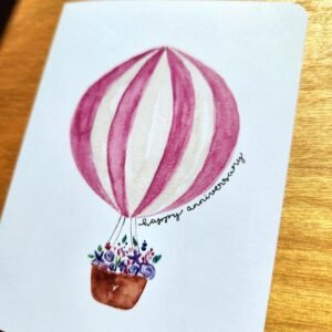
Card Making Styles: Variety vs. Consistency
Can one brand really do it all?
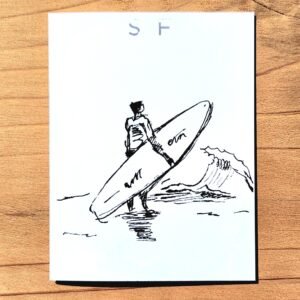
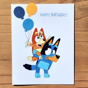
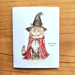
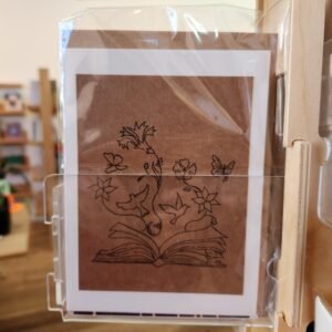
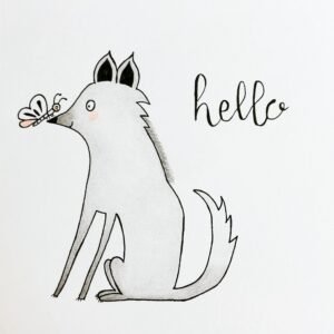
We’ve been making and selling greeting cards for almost five years now. In that time, we’ve explored almost every direction imaginable: animals, flowers, people, landscapes—drawn with colored pencils, markers, watercolor, origami, paper cutouts, and more.

Layers of paper, textures, and details — her way of turning simple scraps into something unique.
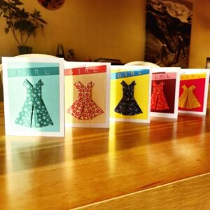
Folds and paper come together to make elegant little dresses.
All this experimenting has been exciting, but it also brought us to a big question:
Should we stick to one more consistent style so people instantly recognize our work, or should we keep experimenting with many styles to reach more tastes?
It’s a question many creators face — whether you’re making jewelry, painting, designing stickers, or even starting a clothing line.
For us, part of the reason we’ve ended up with so much variety is simply because SoliaVenture is two creators. My sister and I each have very different styles, and that naturally shows in the cards we design.


Variety also makes our work appealing to more people:
On top of that, experimenting is fun. It keeps the creative process alive, gives us freedom to explore, and makes it easier to adapt to holidays, new trends, or even special collaborations with stores.
But we also see the value in consistency. Having one recognizable style would make it easier for people to spot our cards in a store or on a shelf. It would simplify our own creative choices because we wouldn’t be asking ourselves “which direction should we take this time?” A consistent look could encourage loyal collectors who come back for “more of that style.” And from the outside, consistency makes a brand feel cohesive and professional, both in marketing and in perception.
So, what’s the ideal approach? For us, it seems to be somewhere in between. A little less variety would help us feel more recognizable while still leaving space for creativity. We’ve already started moving in that direction.
We’ve removed older designs from our website that no longer reflect our style.

Most of our cards are now printed on the same paper and size, instead of the mix of square and rectangle cards we used to make. We’re moving toward a more defined color palette.

The next step for us is improving our photography. To make SoliaVenture feel more cohesive, we want our pictures to look as consistent as our cards. Right now, the backgrounds and lighting vary a little too much, both on our website and on Instagram. We’re excited to learn, practice, and bring more consistency to our photos so that our cards are shown at their very best. Stay tuned — we’ll share more about this in a future blog.
How do well-known card makers handle this question of style? You can see both approaches. Hallmark is known for its huge variety — from cartoon characters to elegant florals — so there’s something for every taste, but no single “Hallmark look.” On the other hand, local artist Amy Rose Moore has a very consistent style. Her animal illustrations are instantly recognizable, and we’ve spotted her cards in many stores around San Francisco and beyond. We love Amy’s cards!
Now we’re curious:
When it comes to greeting cards, do you prefer…
✨ A consistent, recognizable style
🎨 Lots of variety and surprise
🪄 A mix of both
🤝 Before You Go
💌 New here? You can still catch up — read our previous newsletters here.
☀️ Pacheco weather: 84°F this Saturday! Join us in the East Bay for a kids’ community market — check out our event page for details.
Solène, for SoliaVenture